Kingdom Supercultures
Founded by world-class scientists in 2019, Kingdom Supercultures is a B2B wellness and food company that designs microbial communities to invent entirely new types of foods that improve gut health — a first of its kind in the market. Its founders came to RoAndCo to define their strategy and messaging, name the category and brand, and create a brand identity and website.
- Brand Strategy
- Naming
- Brand Identity
- Web Design
BRAND IDENTITY
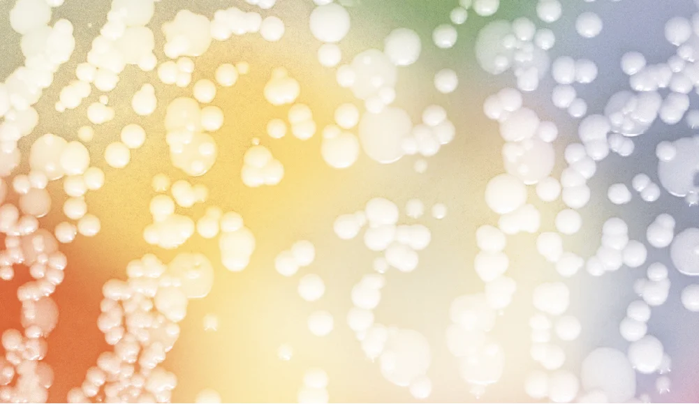
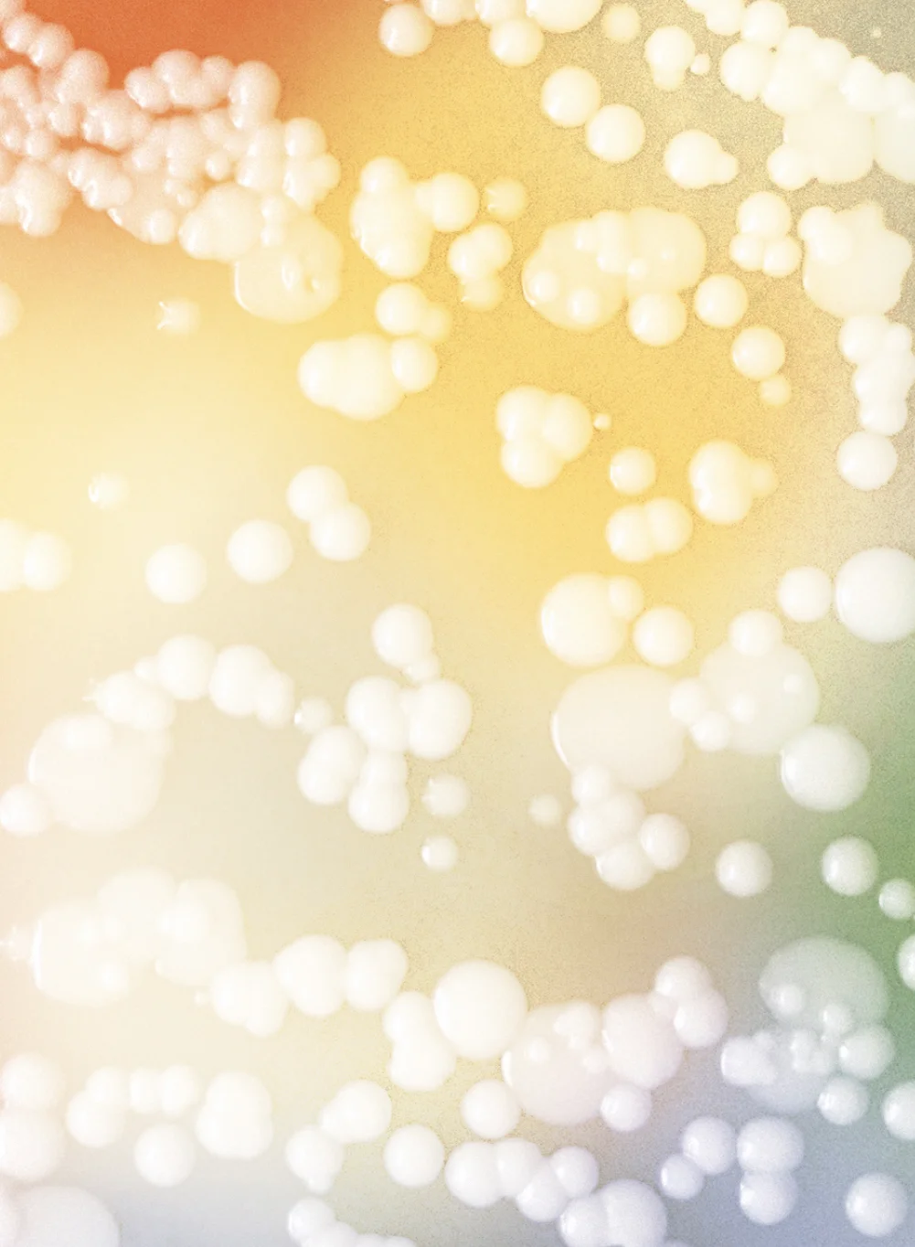
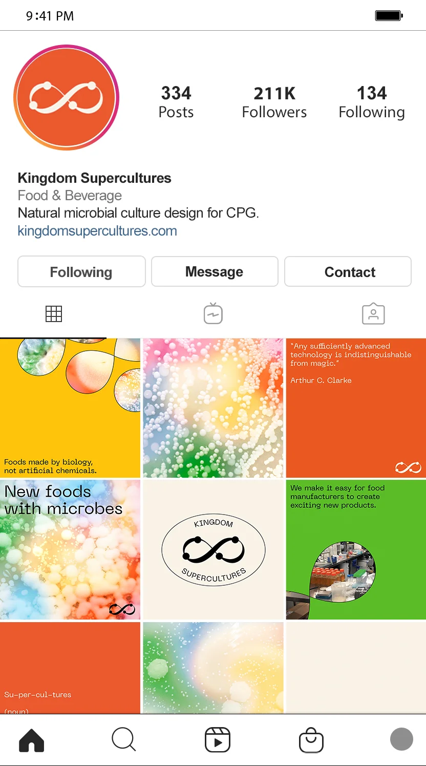
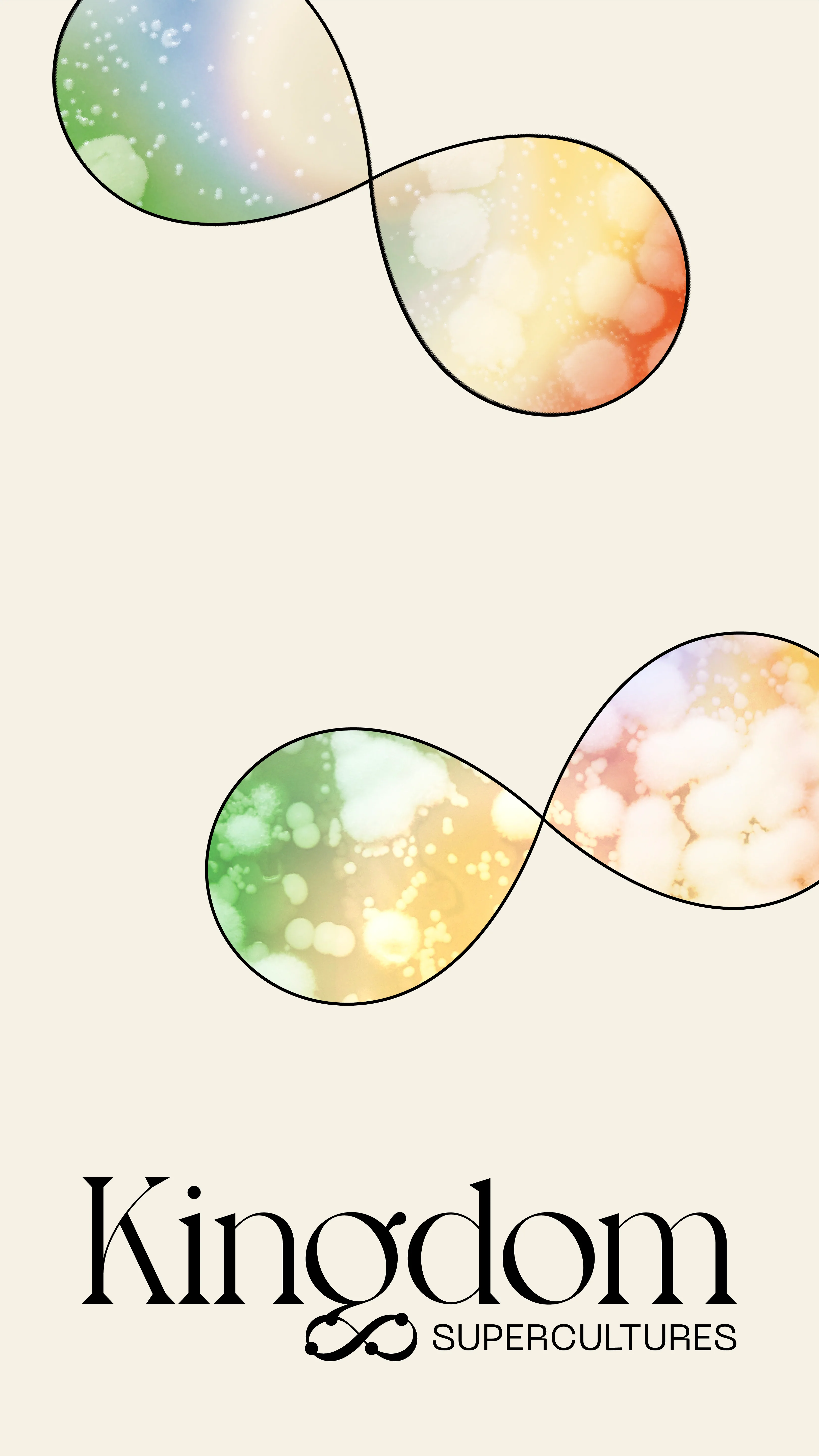
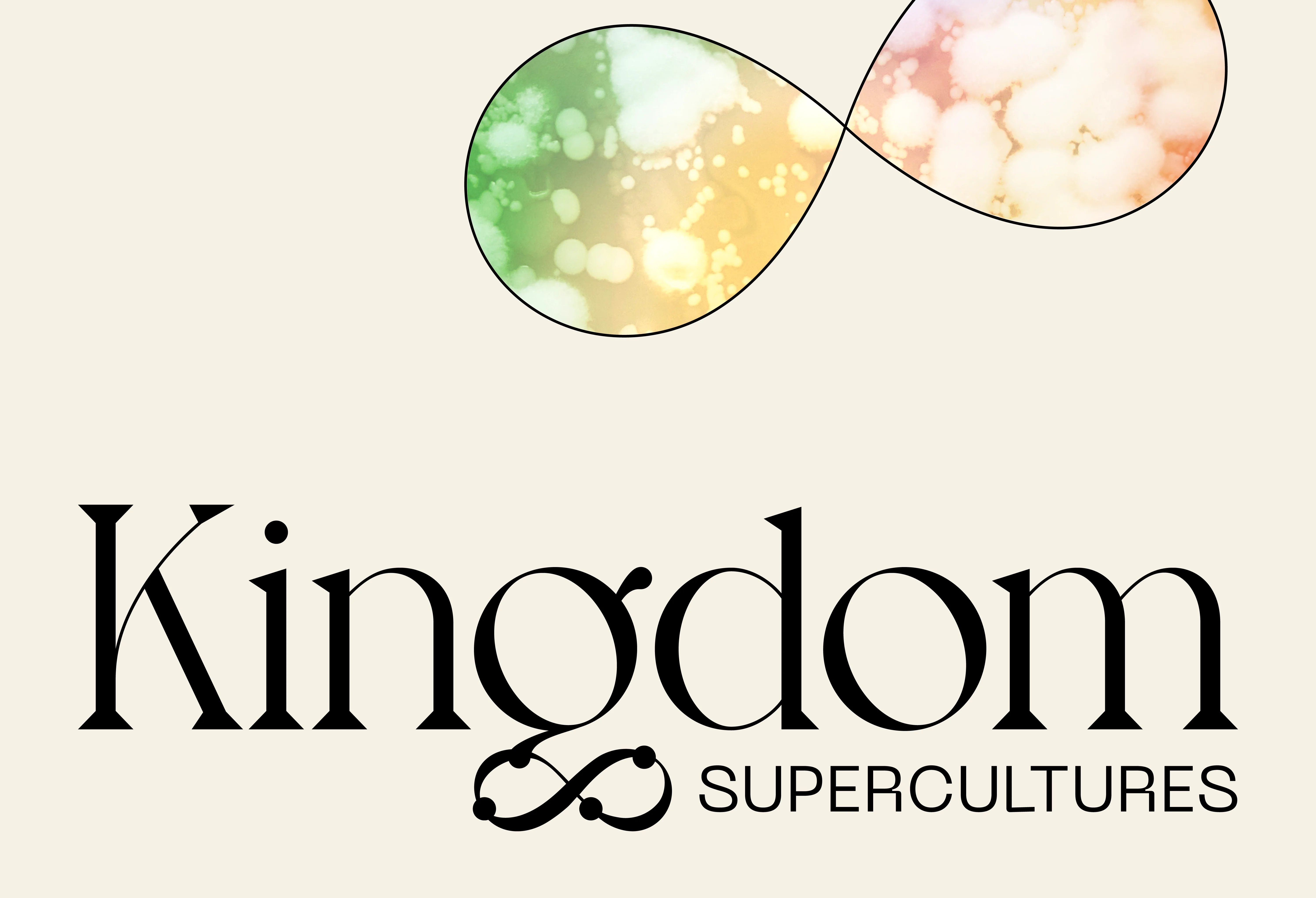
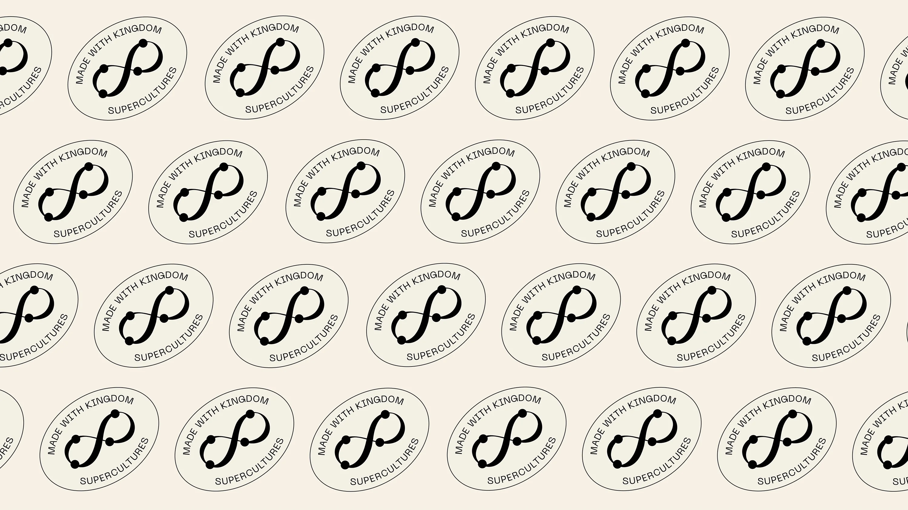
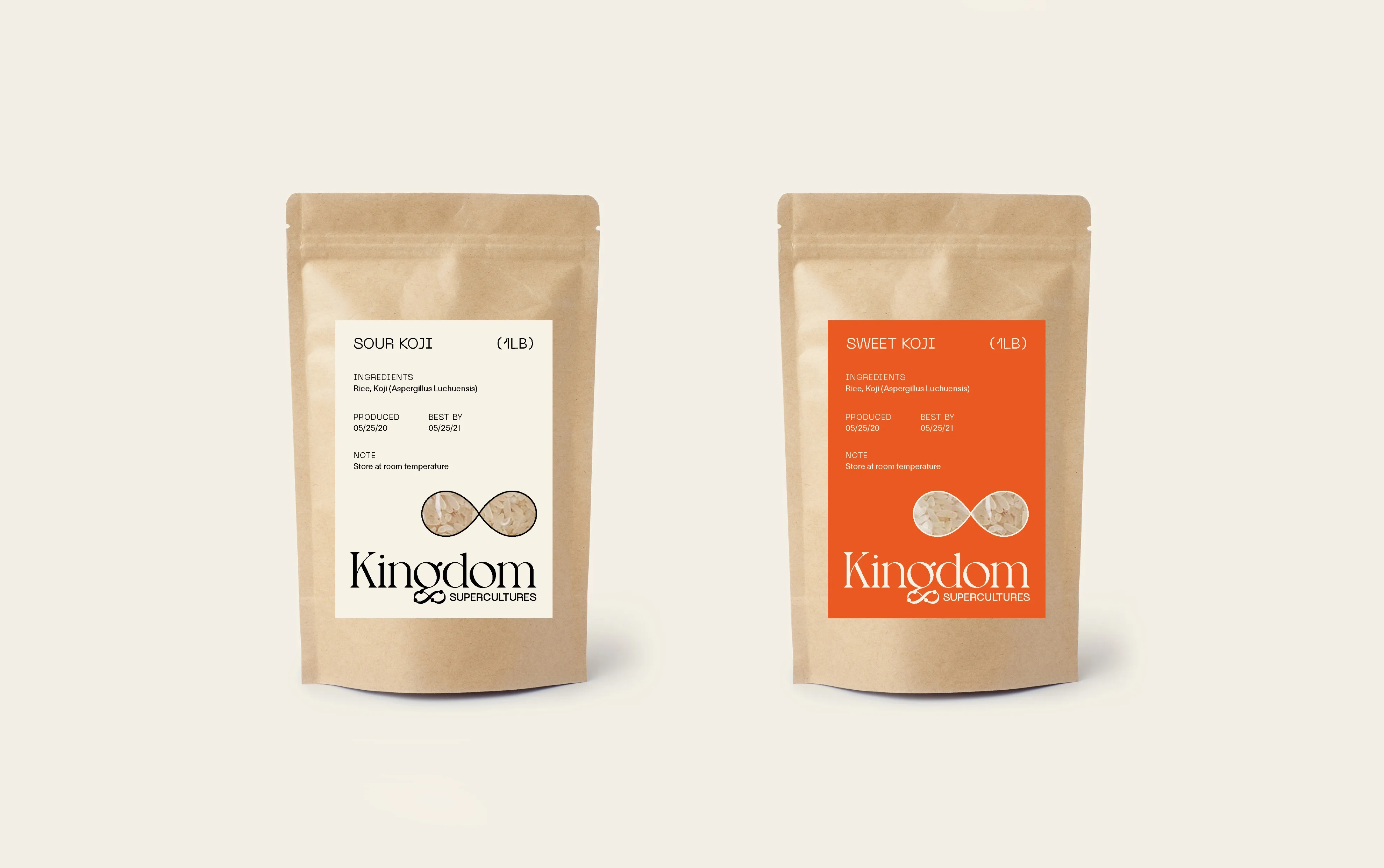
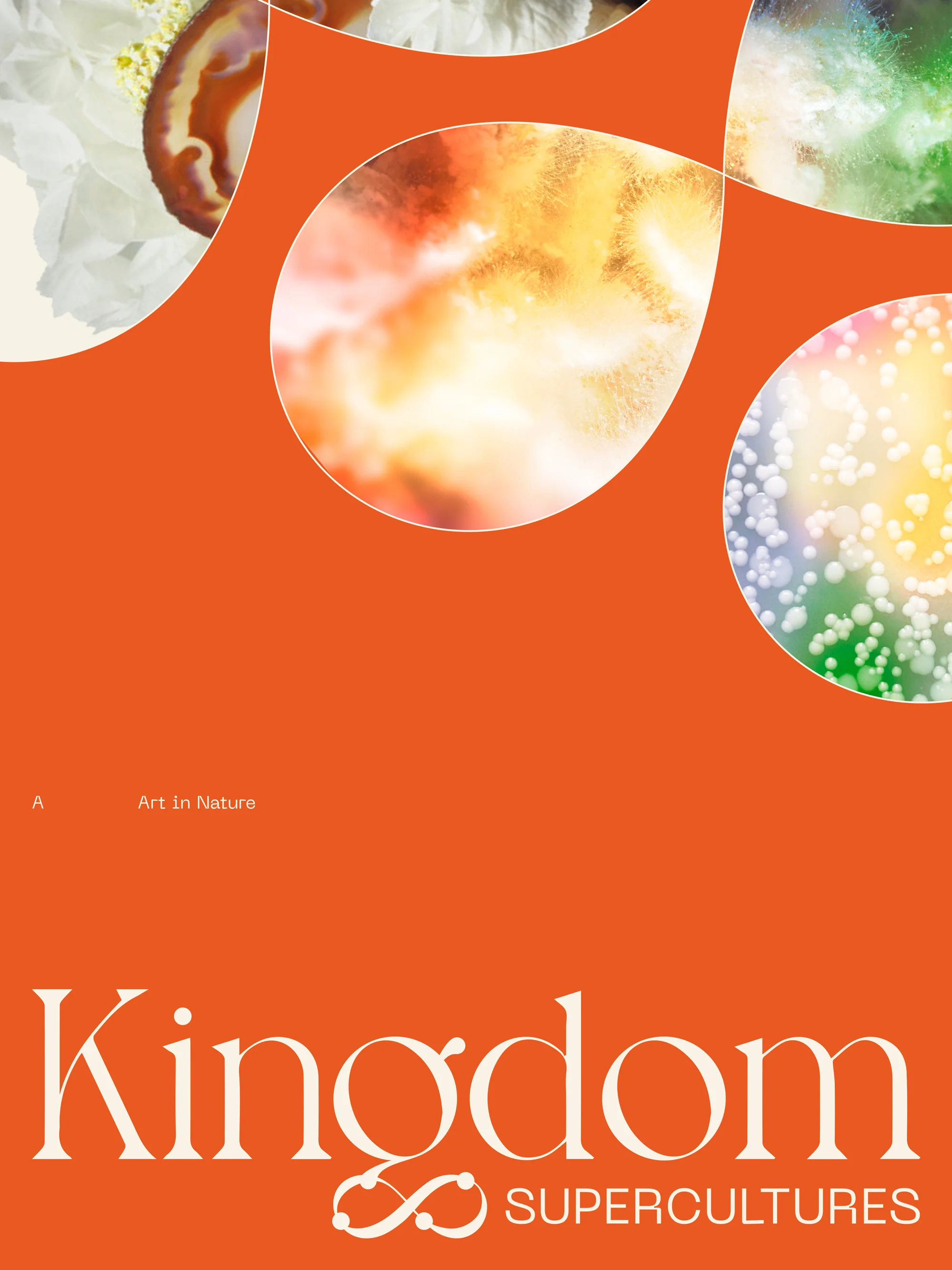
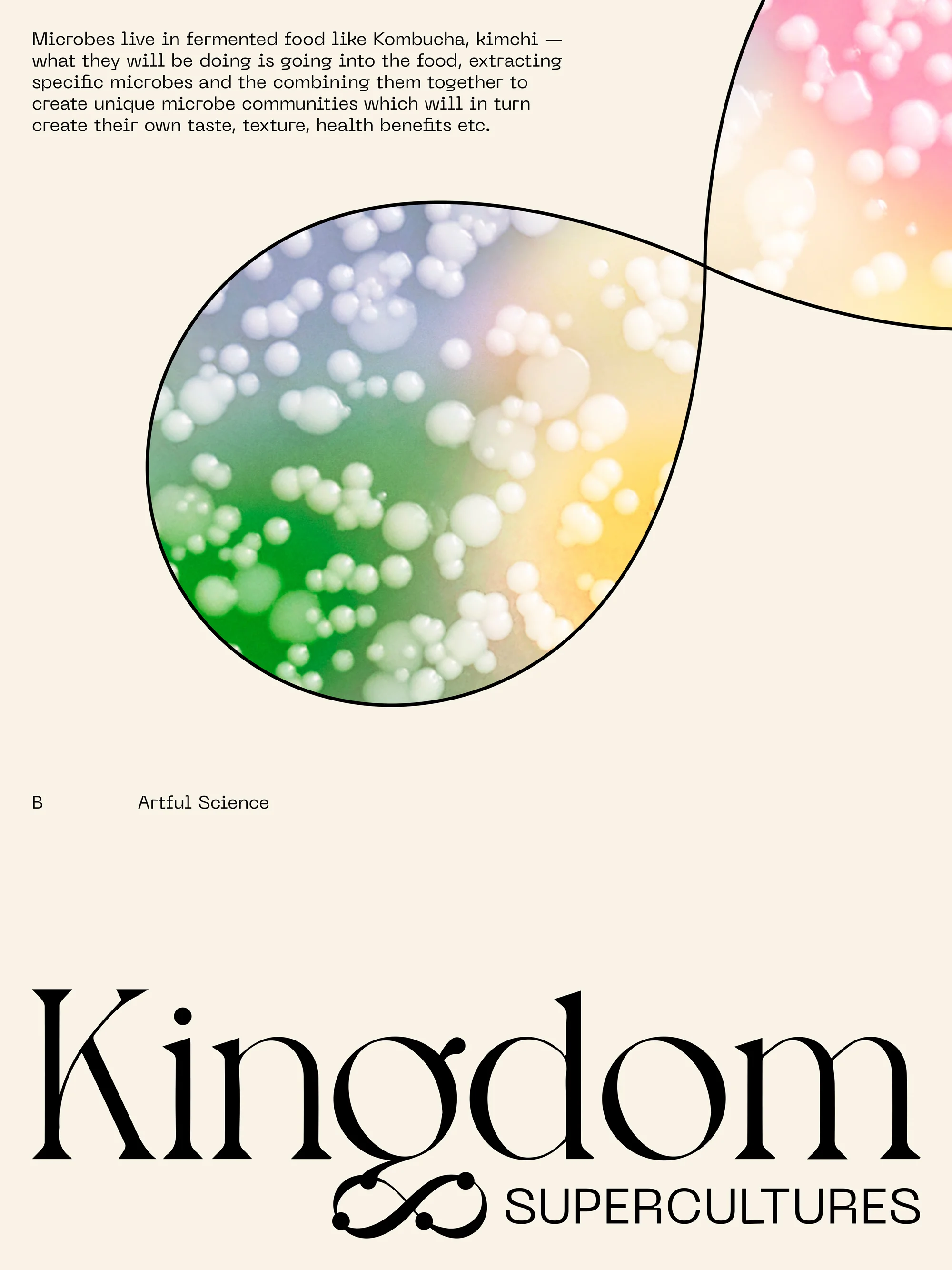
Our identity design emphasizes the science and power of Supercultures. The wordmark is sophisticated with an air of timelessness; the infinity symbol embedded into the ‘g’ represents renewal, balance, and the infinite combinations Kingdom can create from its microbial communities. Enlarged infinity symbols act as a framing device to showcase product imagery. The color palette is bright and bold and works well across both the scientific and culinary industries.
Naming
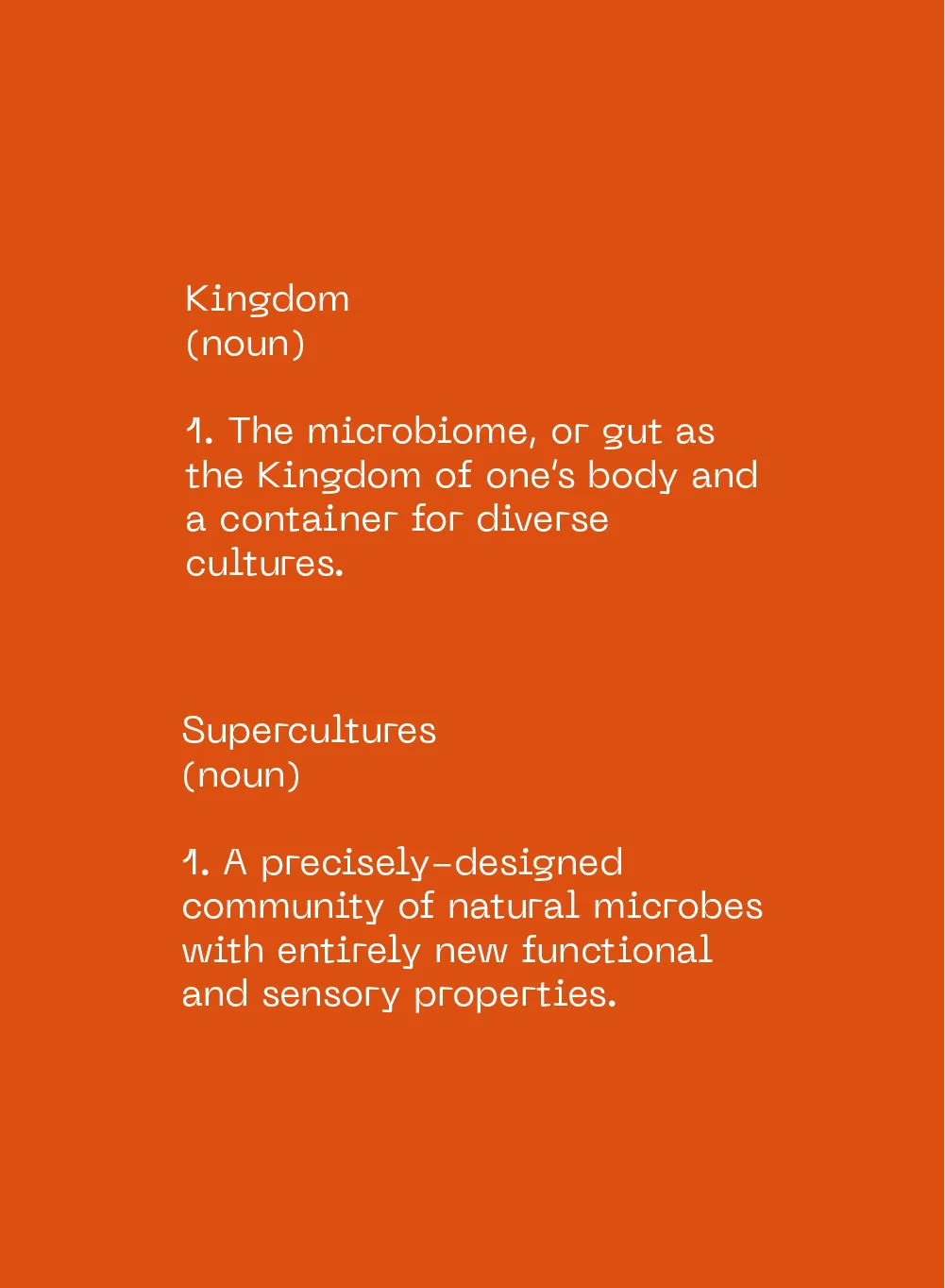
We were tasked with naming not only the brand, but also the new category of food it represents. Through a strategic process, we positioned the brand around expanding the potential of food by restoring life at its core. The name Kingdom refers to the gut's microbiome acting as the kingdom of one's body and a container for diverse cultures, as well as to the word's use in biology as a taxonomic classification. Supercultures, the category name, refers to the hand-selected communities of microbes the brand uses to create new foods with health benefits. Being that the word 'superfoods' is already part of the wellness vernacular, it was a natural fit for the category.
